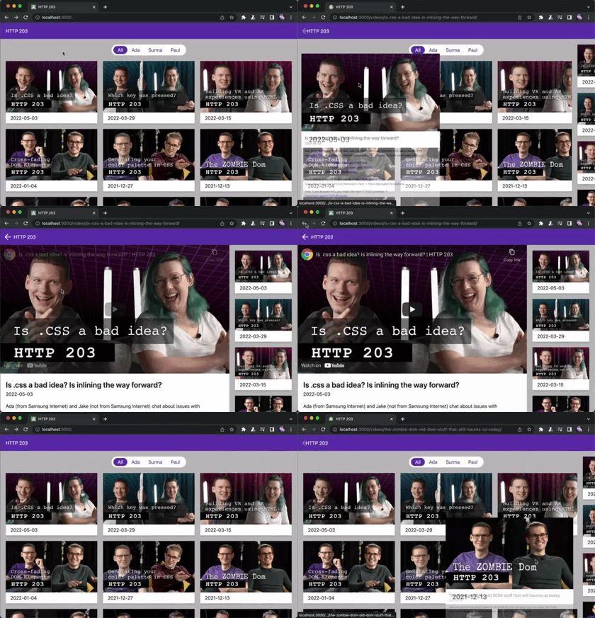
The view Transition API is probably one of the most exciting new CSS mechaninsms. It's currently only available in Chrome Canary, but that's okay. It's designed from the ground up to be a progressive enhancement. It promises to provide a native way to build SPA-like page transitions. (Heck, forget about SPAs. Think of cinematic wipes. Video game manus! Remember fancy DVD menus?)
Basic setup
First of all, we need to enable two flags on Chrome Canary, because View Transitions are still an experimental feature. The flags you’re looking for are view-transition and view-transition-on-navigation.
To get it running on our page we need to set a meta tag on both the document we're navigating from and the one we're navigating to.
<meta content="same-origin" name="view-transition" /> When navigation from one oage to the other, we see a crossfade between the sites. This is the default transition. We can also assign custom ones:
::view-transition-old(root), ::view-transition-new(root) { animation: var(--my-fancy-animation-out); } We can also assign animations to selected elements. That's the way to those bespoke transitions where elements swoop magically into place.
::view-transition-old(swoop), ::view-transition-new(swoop) { animation: var(--my-fancy-animation); } .element { view-transition: swoop; } (Website mock-up and image by the Chrome Dev team)
Speaking of magically, elements morph their position and crossfade their content. This happens automatically by fading out the old element and fading in the new ones instead. We can also set custom animations to both the disappearing and the apperaing content:
::view-transition-old(root) { /* let the old element disappear in some form */ animation: var(--my-fancy-animation-out); } ::view-transition-new(root) { /* show the new element instead */ animation: var(--my-fancy-animation-in); } Fine tuning
For now, animations will always trigger whenever they can. This may have some unwanted side effects. It's nice to see where similar elements come from and go to between navigations, but when they're coming from out of screen, things get confusing quickly.
We can use an Intersection Observer to set the element's view transition only when it's in screen:
const observer = new IntersectionObserver( (entries) => { entries.forEach((entry) => { const el = entry.target as HTMLElement; const transitionName = el.dataset.transitionName; (el as HTMLElement).style.setProperty( "--transition-name", entry.isIntersecting ? `${transitionName}` : "none" ); }); } ); const animatables = Array.from(document.querySelectorAll('.animatable')); animatables.forEach((animatable) => { observer.observe(animatable); }); .animatable { view-transition: var(--transition-name, none); } Sometimes we want to play the transition only in one direction, but not into the other. As an example, I see how the full page crossfade is necessary to support custom transitions on selected elements, but on pages that have no custom transitions, the crossfade loses its right to exist. I could simply remove the meta tag on the target page, but if the target page itself needs to act as a trigger for another view transition to somewhere else, that won’t work either. My solution is to register an event listener on anchor element clicks and remove the meta tag before the browser navigates, cancelling the view transition on all but some selected trigger elements:
const triggers = Array.from(document.querySelectorAll('[data-transition-trigger="true"]')); (Array.from(document.querySelectorAll("a[href]")) as HTMLAnchorElement[]).forEach((el) => { if (triggers.includes(el)) { return; } el.addEventListener("click", () => { document.querySelector('meta[name="view-transition"]')?.remove(); }); }); Now I can fine tune which transitions start on which elements by setting data-transition-trigger="true" on <a href=""> tags.
Jank
Some things feel a bit weird or buggy.
Like described above, it’s hard to create specific transition triggers and endpoints. Sometimes it makes sense for an animation to play only one way, But setting the view-transition property acts as both a trigger and receiver, all the time.
Elements in a transition seem to ignore the stacking context in some cases. Absolutely positioned and sticky elements will display underneath transitioning ones, even when applying (and forcing) z-index.
Scaling an element up doesn’t work properly yet. I can set transform: scale() to positive values, but it will just disable the animation and skip to the new state instead.
Sometimes I can’t overwrite properties that are set to an element. Transitioning background-colors only works of opacity is set. opacity can’t be overwritten whatsoever, but visibility works.
I’m sure most of those bugs are actually just bugs in Chromes current implementation. It’s experimental after all.
Na na na na na na na na Batman!
When I think of transitions, I think of cinematic ones. There are a few iconic ones, like the slow soft wipe in Star Wars or that weird back-and-forth in Easy Rider. But 60’s Batman swirls are probably the most fun ones, to watch and to implement.
Rotating the document should be straightforward enough with a spin animation:
@keyframes spin { to { transform: rotate(2turn); } } But that Batman logo zooming around? Remember how scaling elements up didn’t work properly? There’s a hack we can use to work around that problem. Upscaling doesn’t need to be a transform: scale() function. We can also use transform: translateZ(). This one needs to stay at 1px, or else it bugs out again, but we can animate the perspective freely, making it something like the web equivalent of a vertigo shot. I’ll use the animatable visibility property to hide it outside the animation, because opacity – you guessed it – is buggy. It will substract the element’s base opacity from the animation’s opacity and thus never become visible at all.
@keyframes scale-up { from { visibility: visible; transform: perspective(400px) translateZ(1px); background: url(./logo.png) center no-repeat; background-size: contain; } to { visibility: visible; transform: perspective(1px) translateZ(1px); background: url(./logo.png) center no-repeat; background-size: contain; } } ::view-transition-old(batman) { animation: 0.5s linear both scale-up; } ::view-transition-new(batman) { animation: 0.5s linear both scale-down; animation-delay: 0.5s; } #logo { position: absolute; top: calc(50% - 50px); left: calc(50% - 50px); width: 100px; height: 100px; visibility: hidden; view-transition-name: batman; } Try it out here!
Further Reading
- The chrome dev team has a very extensive article about view transitions.
- Dave Ruperts implementation in his own website.
- Jeremy Keith’s thoughts on it.

